THREE quick online resources to learn visual best practices
Posted on: October 1, 2022
Post Category: Data
Data visualisation is an overlooked aspect of data analytics/science.
In the data analytics community, there is a clear hype around building complex machine learning models and learning the tools.
But how do you translate the insights from your analysis into business value? You communicate – to decision makers within the business.
Often, this involves charts and presentations, and most analysts do not focus on this.
In data analytics, communication is just as important as analytical skills, and communicating insights requires an understanding of visual best practices.
Here are THREE quick online resources to learn visual best practices…
1. Tableau’s Visual Analytics Guidebook – for chart best practices

The Tableau Visual Analytics Guidebook introduces the importance of good visual analytics and the Tableau software. In the guidebook, readers can learn more about the different visualisation families (charts, maps and tables) and some of the different visualisations that fall under each family.
For each visualisation, there is information on how to read them, their best practices, when to use them and when not to use them. This also includes examples that are well-done and examples that are poorly-done. Below is some information on one of the visualisations – pie charts.

To access the Visual Analytics Guide, click here.
2. Tableau’s Visual Best Practices guide on Tableau Blueprint Help – a generalised visual best practices guide for designing for your user or audience

The Visual Best Practices guide on Tableau Blueprint Help is a short post highlighting the most important considerations when creating data visualisations. These are shown on the menu on the right-hand side: Audience, Context, Chart Choice, etc.
It is a useful resource that goes beyond selecting what charts to use, and focusses on optimising value for the user/audience.
Here are some key insights from the Visual Best Practices guide:
- The best visualisations have a clear purpose and work for their intended audience. Consider how much your audience knows, what they need to know and how much they need to know.
- Use a clear hierarchy when it comes to typography. Text elements that are larger, bolder or darker will attract more attention.
- Use a layout that enables a sensible logical flow of information. Consider the Newspaper or Z-layout, use of white space, and the size of different elements/objects.
To access the Visual Best Practices guide, click here.
3. Andy Kriebel’s Visual Vocabulary – quick lists of recommended chart types for different types of analysis
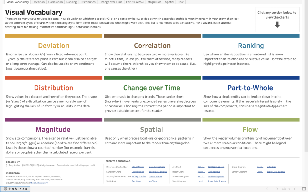

The Visual Vocabulary is a resource on Tableau Public that offers chart ideas for different data relationships. The resource was created by Andy Kriebel, who is currently the Global Head Coach of The Data School. Andy Kriebel was also a co-leader for one of the most popular Tableau Community projects – Makeover Monday.
In the Visual Vocabulary, readers can select from and see appropriate charts for different data relationship categories, including:
- Deviation
- Correlation
- Ranking
- Distribution
- Change over time
- Part-to-whole
- Magnitude
- Spatial
- Flow
It is a useful resource for analysts who have a key message in mind and would like to know what charts they could use.
To access the Visual Vocabulary, click here.
More resources
The online resources mentioned are great for reference for junior analysts who would like to get an elementary grasp of (good) data visualisation.
And they are even better for more experienced analysts who already understand the underlying storytelling and design theory.
However, as these resources are relatively short, there may not be enough illustrative examples for readers to get a deep understanding.
For more illustrative examples – including actual ready-made visualisations – there are books available, with more detailed explanations of visual best practices. To learn more about what books are available, and what they are about, click here.

About the author
Jason Khu is the creator of Data & Development Deep Dives and currently a Data Analyst at Quantium.