THREE books for learning visual best practices
Posted on: October 2, 2022
Post Category: Data

Building effective data visualisations and dashboards requires practice.
A good way to start is by learning visual best practices and looking at many illustrative examples.
Some books out there are non-technical, beginner-friendly, and will help up-and-coming analysts learn these best practices AND see examples.
So here are THREE books for learning visual best practices…
1. #MakeoverMonday: Improving How We Visualise and Analyze Data, One Chart at a Time by Andy Kriebel and Eva Murray.

#MakeoverMonday is a Tableau Community project where, every week, community members get to give an already-published visualisation a makeover.
#MakeoverMonday also happens to be a book written by the Community project leaders, Andy Kriebel and Eva Murray.
Many illustrative data visualisation examples, created by members of the Tableau Community, are used to highlight the key ideas covered in the guide. And from my experience reading the guide, the content can be split into two chunks: (1) interpreting the dataset(s), and (2) creating a clean and interpretable visualisation that gets your key message across.
The #MakeoverMonday Community project itself also presents a valuable opportunity for analysts to work on simple data analysis/visualisation projects end-to-end. I would recommend this to junior analysts who would like to learn important visual best practices and add some data visualisation projects to their portfolio.
Here are FIVE key insights from #MakeoverMonday, the book:
- Understand the context, the data and the appropriateness of different aggregations/metrics
- Keep visualisations clean and simple, and use universal formatting
- Use colours sparingly and use them to create associations
- Use text and text formatting to inform and reinforce your key message
- Design for your audience and iterate
2. Storytelling With Data: A Data Visualization Guide for Business Professionals by Cole Nussbaumer Knaflic.

While #MakeoverMonday focusses on the end-to-end process of creating effective data visualisations, Storytelling With Data (specifically) focusses on creating data stories that deliver business value – starting with the business problem and ending with presentable insights for clients.
Readers get thorough insight into visual best practices by understanding the gestalt principles of visual perception, preattentive attributes and relevant design concepts. The book is simple and contains lots of simple yet illustrative examples, including case studies.
I’d recommend this read for analysts in the consulting space – or consultants who work with data.
Here are FIVE key insights from Storytelling With Data:
- Aim to concisely articulate the who, the what, the how, the 3-minute story and the big idea
- Select an appropriate chart type and reduce cognitive load
- Direct attention using preattentive attributes
- Optimise the four A’s of design – affordance, accessibility, aesthetics and acceptance
- Communicate your insights through a structured narrative
3. The Big Book of Dashboards: Vizualising Your Data Using Real-World Business Scenarios by Andy Cotgreave, Jeffrey Shaffer and Steve Wexley.
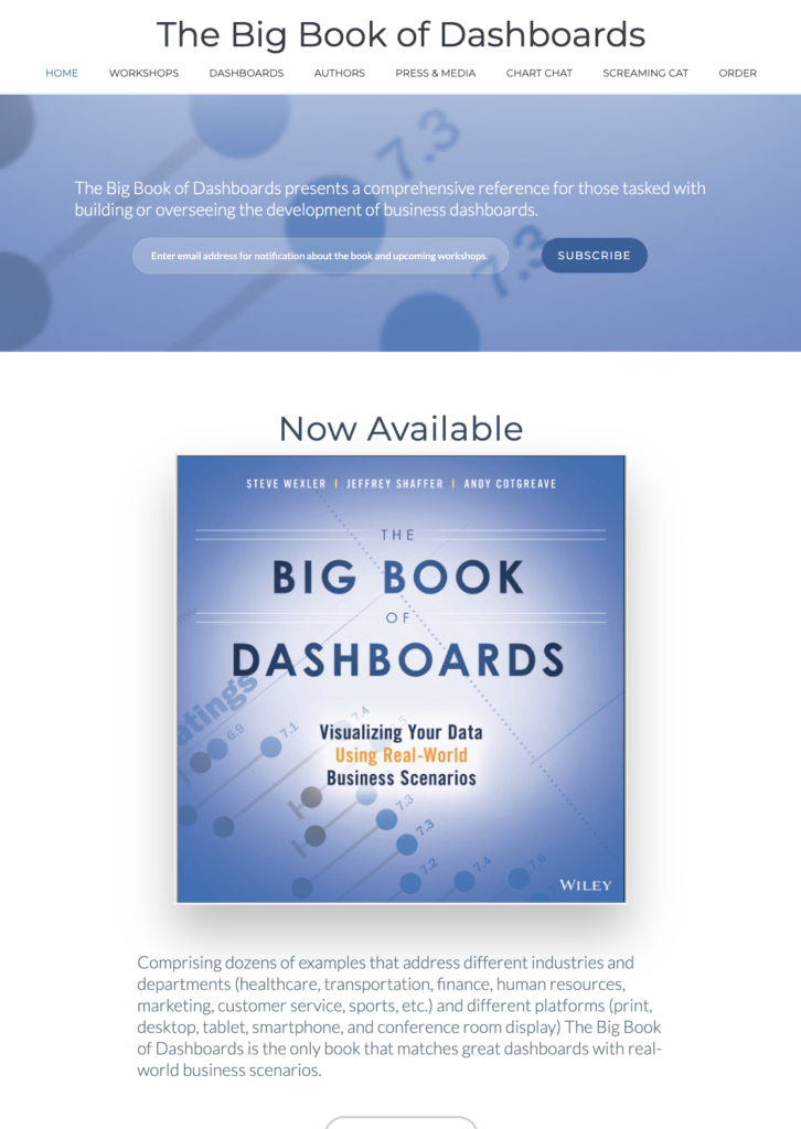
The Big Book of Dashboards is indeed quite big.
Before publishing, the book was actually reviewed by Andy Kriebel and Cole Nussbaumer Knaflic, who are authors of #MakeoverMonday and Storytelling With Data respectively.
The book provides an in-depth analysis on dashboards from a wide variety of business scenarios. And the book is divided into three sections: (1) A Strong Foundation, (2) The Scenarios, and (3) Succeeding in the Real World.
There are 28 different business scenarios, and for each scenario you can gain a nuanced perspective of how each dashboard is effective, by reading the authors’ commentary. If there was a key takeaway, it would be that there is no perfect dashboard, BUT an effective dashboard is one that serves the requirements and tendencies of their audience.
A great reference resource for analysts who are involved in the development of business dashboards.

About the author
Jason Khu is the creator of Data & Development Deep Dives and currently a Data Analyst at Quantium.