UNSW students learn Tableau and create a data story in 2 days – 2022 Dataviz Hackathon Recap
Posted on: September 3, 2022
Post Category: Student Experience
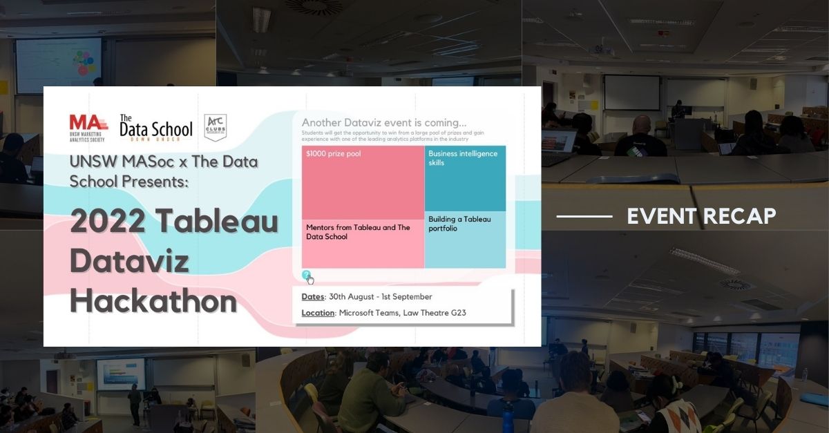
Between the 30th of August and 1st September, 8 groups of students from UNSW were tasked to create a dataviz and present a data story.
The data, which was produced by Ember, described different sources of energy and their usage in different parts of the EU – from 2000 up to 2020. See the data source here.
In spite of most participants being new to the software and data visualisation, all groups managed to pull through and share interesting insights!
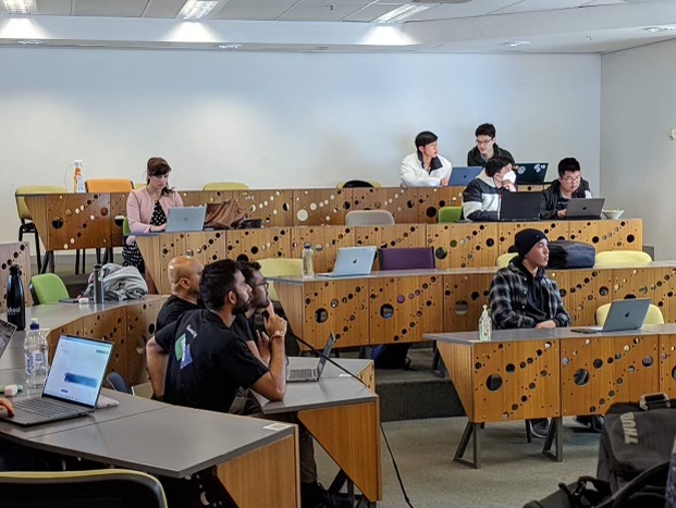
The groups had 48 hours to work on the task, got exposure to some visual best practices, got to take a Tableau 101 workshop, and got up to 90 minutes of mentoring from experienced Tableau Ambassadors and MIP consultants.
All groups got to present their stories to a judging panel, consisting of three consultants from MIP, for five minutes, while also receiving feedback and answering questions.
But since it is a hackathon, there could only be a handful of winners…
Keep scrolling to see the winners (and the honourable mention)!
Introducing the winners!
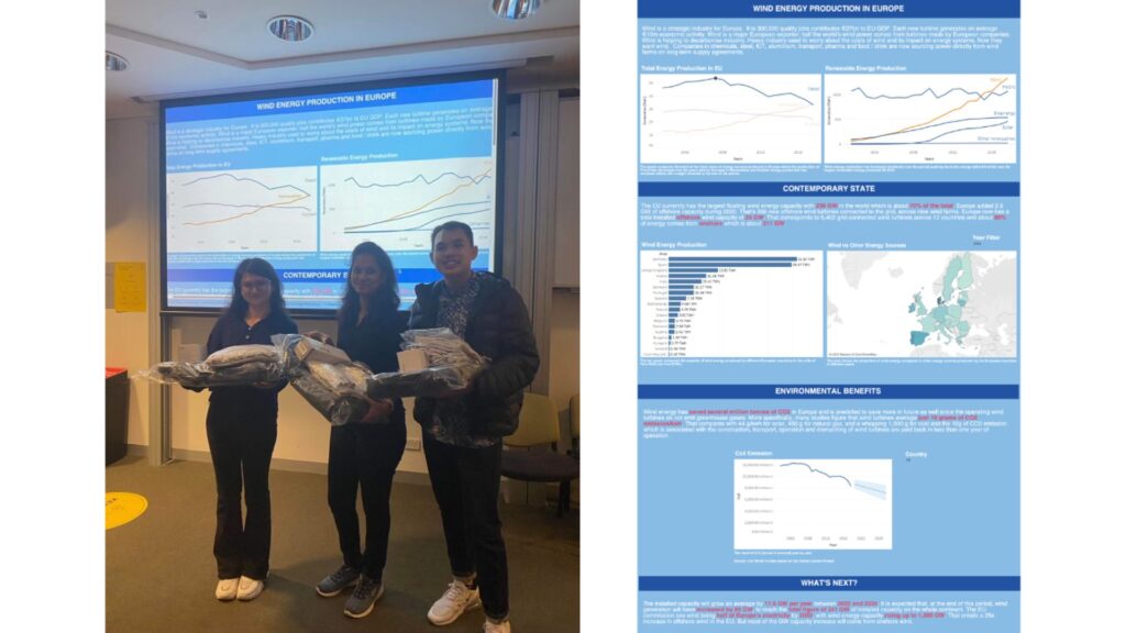
In 1st place was Group 10 (mentored by Frederic) – with their deep-dive into Wind as a renewable energy source!
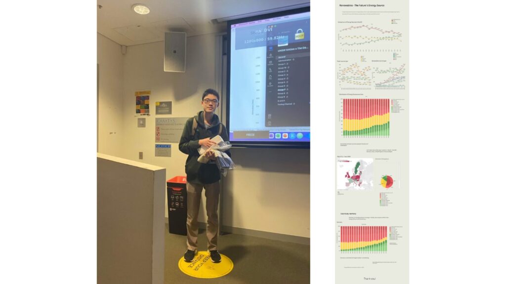
In 2nd place was Group 5 (mentored by Frederic) – with their interactive animation and deep-dive into Germany’s renewable energy!
In 3rd place was Group 4 (mentored by Thi) – with their deep-dive into Poland and recommendations to drive the usage of more sustainable energy sources!
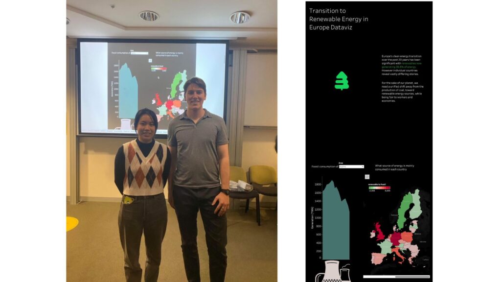
And finally, the honourable mention, Group 9 (mentored by Thi) – with their unique and captivating storytelling!
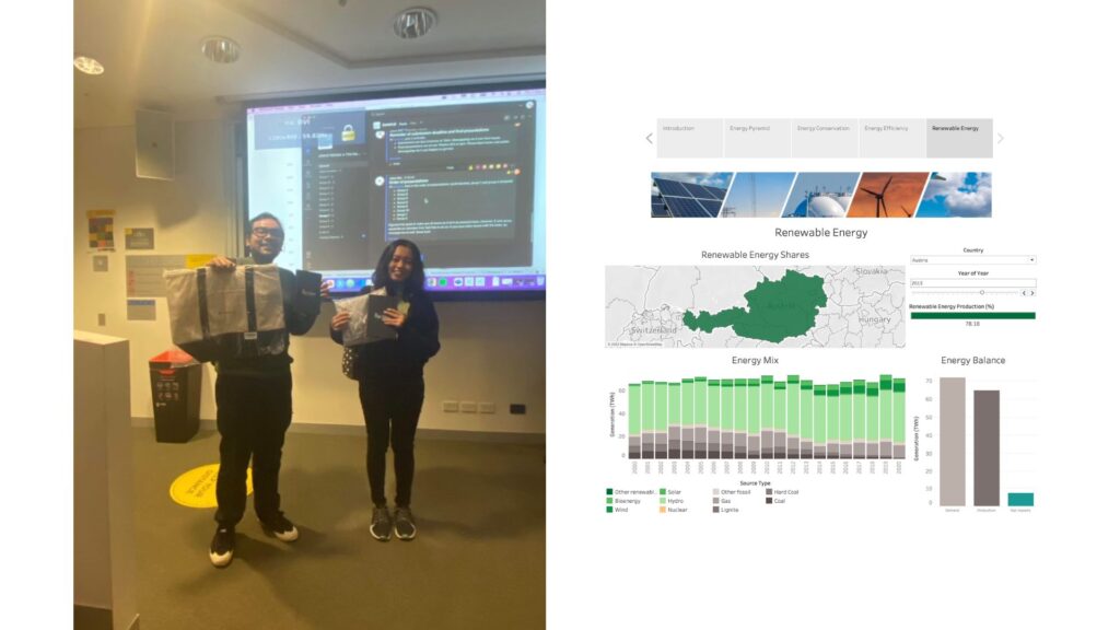
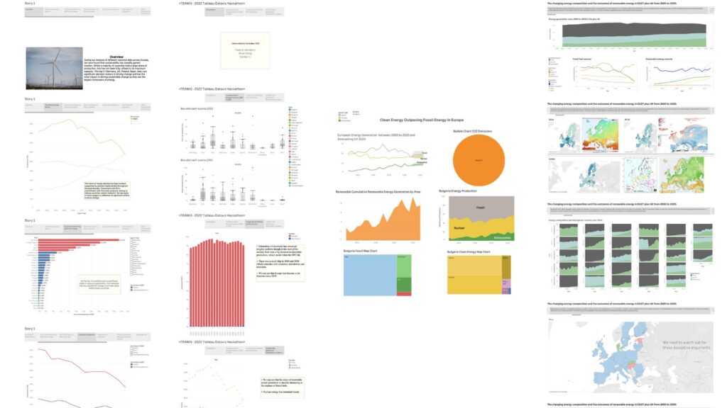
Also, for the rest of the groups who took part, it was awesome seeing their insights and sustained effort throughout the event!
For future Tableau hackathons…
As per feedback from one of the mentors, we hope that a future Tableau Ambassador at UNSW take on these improvements for future Tableau hackathons, should they continue hosting such an event:
- Offer some time for the participants to meet amongst themselves before going into the first mentor meeting
- Extend the second mentor session from 1 hour to 2-3 hours – to offer more time for groups to receive feedback on their visualisations, and plan, prepare and get feedback on their presentations
And a huge thank you to all the people who made the event possible…
- Lisa Meyer, from MIP, for helping organise the event and contributing prizes for the honourable mentions.
- Ellesan Leung and the rest of her team, from the UNSW Marketing Analytics Society, for helping organise the event.
- Alex Taylor-Jackson, from MIP, for getting MIP representatives involved in the mentoring and judging, introducing The Data School and teaching the students visual best practices.
- Ben Szabo, from MIP, for mentoring his team.
- Kimly Scott, Thi Ho and Frederic Fery, for volunteering to take part as mentors for the teams.
- Alekh Srivastava, Sachin Wijeratne and Krishna A, from MIP, for judging the presentations.
- Ezra Calis and Bergen Schmetzer, from Tableau, for sorting out the prizes for 1st, 2nd and 3rd place.

About the author
Jason Khu is the creator of Data & Development Deep Dives and currently a Data Analyst at Quantium.