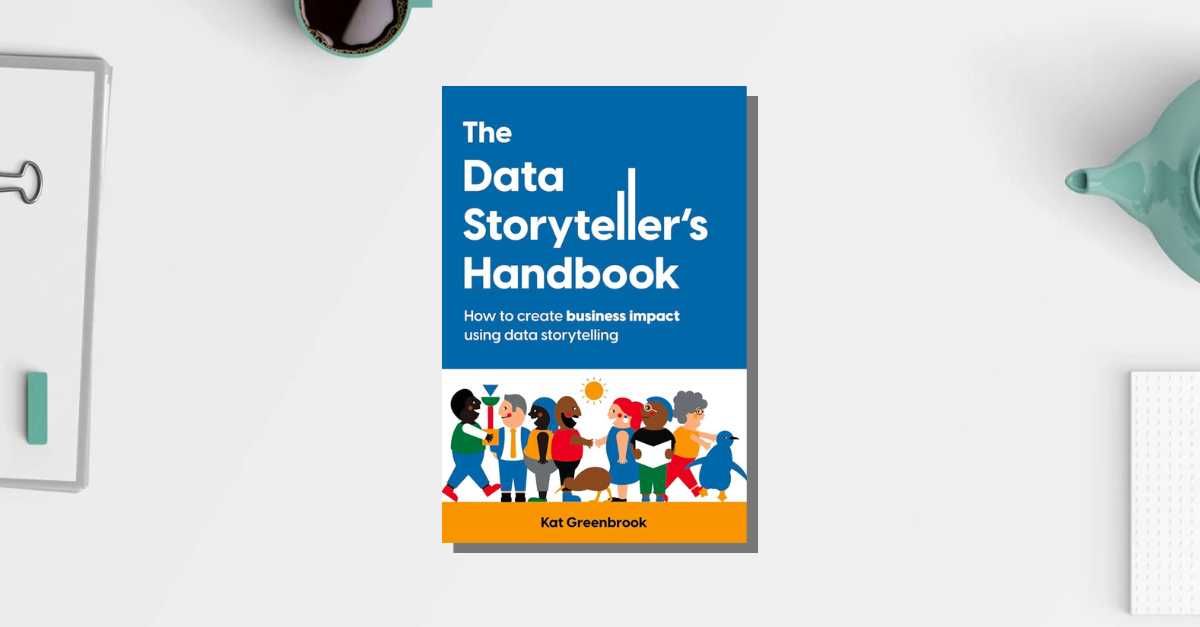
My top 5 takeaways from The Data Storyteller’s Handbook by Kat Greenbrook
Posted on: January 10, 2024
Post Category: Book Notes
I followed Kat Greenbrook for a couple weeks leading up to the release of this book.
And I saw that Cole Nussbaumer Knaflic wrote the foreword of the book. For context, Cole wrote one of the most influential data storytelling books: ‘Storytelling with Data’ (which I have also read).
So I thought why not give this book a go too.
And, overall, it’s a great read.
If you’re from a technical background – perhaps you’re a data analyst or academic – the format is highly visual and refreshing, and that is what makes the book stand out from other data visualisation/storytelling books out there.
And if you’re not from a technical background, this is a very friendly guide for anyone interested in learning data storytelling skills from the ground up.
The explanations are clear, the frameworks are simple and intuitive, and there are plenty of examples to illustrate/validate how effective those frameworks are.
In this short blog post, I will be sharing the top 5 insights I’ve gained from reading the book.
Obviously these 5 insights are not representative of everything in the book. If you want to learn more, do get it.
1. The difference between a data story and data visualisation
Honestly, I never really thought about the difference.
But TL;DR, data visualisations are basically visual representations of data, and they are created to either explore, inform or educate:
- When you create a dump of charts in order to get familiar with a dataset, they are created to explore.
- When you create charts/cards that go on a dashboard, they are created to inform.
- When you create charts for a data story, they are created to educate.
While on the other hand, a data story is a narrative that involves a data-derived message. And this narrative is often supported by the use of data visualisations (created to educate).
2. Use the PGAI framework and user stories, to think like a designer and put your audience first
A story should align with business objectives – to work on an existing problem, make progress towards a goal, influence action and make an impact.
And to get there, there needs to be an understanding of your audience. Hence the PGAI framework and user stories.
The PGAI framework Is used to understand the problem, goal, action and impact, so you can tailor your message/story accordingly and figure out who your audience should be given the action you want to achieve:
- The business problem i.e., what is the business struggling with?
- The desired goal i.e., what outcome would minimise the problem?
- The action taken, or the action you recommend should be taken
- The business impact created, or the business impact the action will create
And to understand your audience, create user stories for different personas in your audience. Write from the perspective of your end user: ‘As an [insert audience], I want [the action you hope to achieve], so that [get a result they care about, or something that motivates them].’ Here’s an example I stole from the book: ‘As a marketer, I want to understand this product’s lifecycle analysis, so that I can identify any reputation risk to our brand’.
3. How to bring the technical level of your data story, to the level of your audience (so that they can understand)
Answer these questions about your audience, and for each question, draw their ’empathy’ spectrum. For each spectrum, you can draw a line, where on the left hand side you have A, and on the other side you have B:
- How well do they understand your topics? (A: Novice, B: Expert)
- How do they prefer to be communicated with? (A: Summary, B: Detail)
- How are they likely to react to your message? (A: Spontaneous, B: Thoughtful)
- How interested are they in your information? (A: Low Interest, B: High Interest)
Then plot where your audience sits and where *you* sit.
After that, plan accordingly how you should present your story:
- If you understand the topic more than your audience, avoid needless complexity
- If your audience prefers more summarised insights, summarise your findings
- If your audience is more likely to react spontaneously, tailor your message so that it’s more positive, provoke thoughtfulness or build that relationship before sharing your story.
- If your audience is less interested in your information, make it more persuasive
4. The ABT framework for creating a data story
The ABT framework is basically a framework that helps us carve out an entire story from start to finish.
And this full-length story *can* involve multiple stories (of different types) nested inside each other.
So what is the ABT framework? And, But and Therefore:
- We use ‘And’ to link sentences that set the scene/context of our story
- We use ‘But’ to introduce conflict
- We use ‘So’ to introduce a recommendation/insight to mitigate whatever is causing the conflict
5. Emotive elements
Using emotive elements is all about using a select set of pictures and personal stories/testimonies in order to give deeper meaning/emotion to the data.
In my current role as an analyst, I learnt to appreciate connecting with the people that the data represents – and not just dedicate my attention to pure numbers and the business’s best interests. Because business decisions will always impact people.
So whenever it comes down to creating a full slide-deck data story, I’ll be keeping this tip in mind.
Final thoughts
So overall: personally, I think the book teaches great frameworks that will help you understand your audience (and produce tailored stories/charts).
It’s not going to go into detail about visual best practices (which, I think is important to know as a data analyst), but there are already plenty of books out there that cover that well.
So if you’re new to data analytics or data storytelling, I’d say this book is great to learn the fundamentals.
And if you’re not sure about whether to pick up the book, it’s not a long read anyway – you’ll get pretty deep even if you check it out for just an hour or two.

About the author
Jason Khu is the creator of Data & Development Deep Dives and currently a Data Analyst at Quantium.