How I built the Uni-rankings comparison dashboard
Posted on: January 10, 2024
Post Category: Data
Last year, I shared a data visualisation that compared University rankings in Australia.
And in this blog post, I’ll be sharing the entire process of how I built it – from what inspired the question to publishing the visualisation on Tableau Public (hopefully in 5 minutes or less).
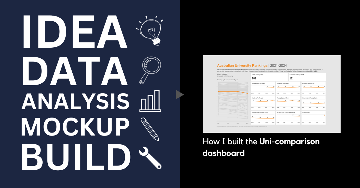
So I’ll talk about the following steps: Idea, Data, Analysis, Wireframe/mock-up, Build.
Idea
One of my previous works was a grad role comparison dashboard, and I thought that it was a valuable tool for students who wanted to explore their options.
So I thought I’d bring that kind of value back to the University level, using accessible and familiar Uni-ranking data – and so I chose to use the QS University rankings.
Data (collection and cleaning)
To collect the data, I used a web scraper powered by Selenium. The web scraper would input my credentials, go through the relevant web pages, select the correct filters, expand the entire dataset, etc.
In terms of data cleaning, there were instances where the ranks were in a range, and the overall score was not available. I replaced these rank ranges with the same *relative* rank, so they could be easily interpreted in Tableau later down the line.
So the resulting schema of the dataset was like this:
- Global rank
- Year
- Relative rank by year
- Uni name
- Overall score
- [Scores split by different categories – e.g., international students ratio, international faculty ratio, etc.]


For anyone who wants to access the code I used to scrape and clean the data, you can find it here: https://github.com/AKhuZ-Code/qs-university-rankings
Analysis
Regarding the analysis, I basically skipped this step.
I didn’t want the data visualisation to follow a story per se. My intention was to simply create a dashboard-style visualisation for users to filter for a specific University and see how it placed/scored relative to other Australian Universities.
Wireframe/mock-up
Because the data was quite complex, I didn’t have a specific idea of what the dashboard would look like. Do I use the raw value of the metrics…? Do I just use relative rankings…?
But regarding the layout, I was confident with creating a high-level chart on the left hand side, with more detailed charts on the right hand side.
Initially, I wanted to use a bump chart (somewhere) and I was dead-set on creating this. Because I figured this was the best way to show the rankings of all Universities and how they changed over time.
And on top of this, I wanted to show the latest score of the selected University – overall, and across the different categories measured in the dataset. This would be accompanied with a simple directional measure, showing how many spots they went up/down compared to the previous year.

But I didn’t go ahead with using these “KPIs”. I wanted to give context behind the different metrics, perhaps by using an info icon or text next the name of each metric, but I figured that would make the cards too crowded. And I wanted to give more context to the numbers – by including more historical values *and* how they ranked.
So I took a different approach: instead of using the (latest) raw measure values, I decided to just visualise the change in rankings overtime for each category.
I figured as a user/student this would be more valuable since comparison is the objective.
I eventually created the bump chart for all the rankings. And I came up with a fleshed-out version of the design, on the fly while building it in Tableau.
Build
Simply put: I built it in Tableau, and used YouTube videos to create the more advanced charts and measures.
See the final product below, or interact with the visualisation on Tableau Public here: https://public.tableau.com/app/profile/jason.khu8035/viz/QSRankings_16999077573760/Dashboard


About the author
Jason Khu is the creator of Data & Development Deep Dives and currently a Data Analyst at Quantium.