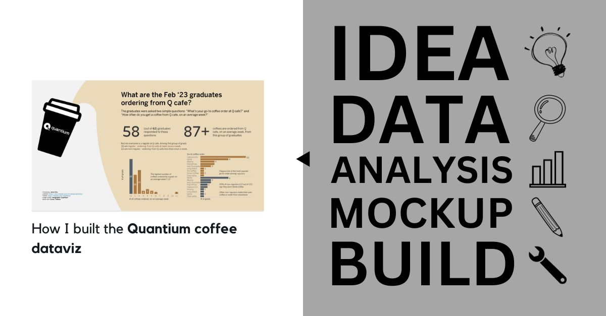
How I built the Quantium coffee data visualisation
Posted on: January 10, 2024
Post Category: Data
Last year I shared a data visualisation sharing the 2023 Quantium graduate cohort’s coffee getting/drinking habits at Q-café.
And in this blog post, I’ll be sharing the entire process of how I built it – from what inspired the question to publishing the visualisation on Tableau Public (hopefully in 5 minutes or less).
So I’ll talk about the following steps: Idea, Data, Analysis, Wireframe/mock-up, Build.
Idea
For context, last year was my first year in the corporate world. And my data analyst role at Quantium was my first full-time data analytics gig.
And one of the things I enjoyed about student programs at companies, historically, was that they offered a good opportunity to meet and make friends with others who are at a similar stage of their student/work career.
But at Quantium, there wasn’t too much of this social interaction (but hey, what can you really do with a cohort of 60+ people).
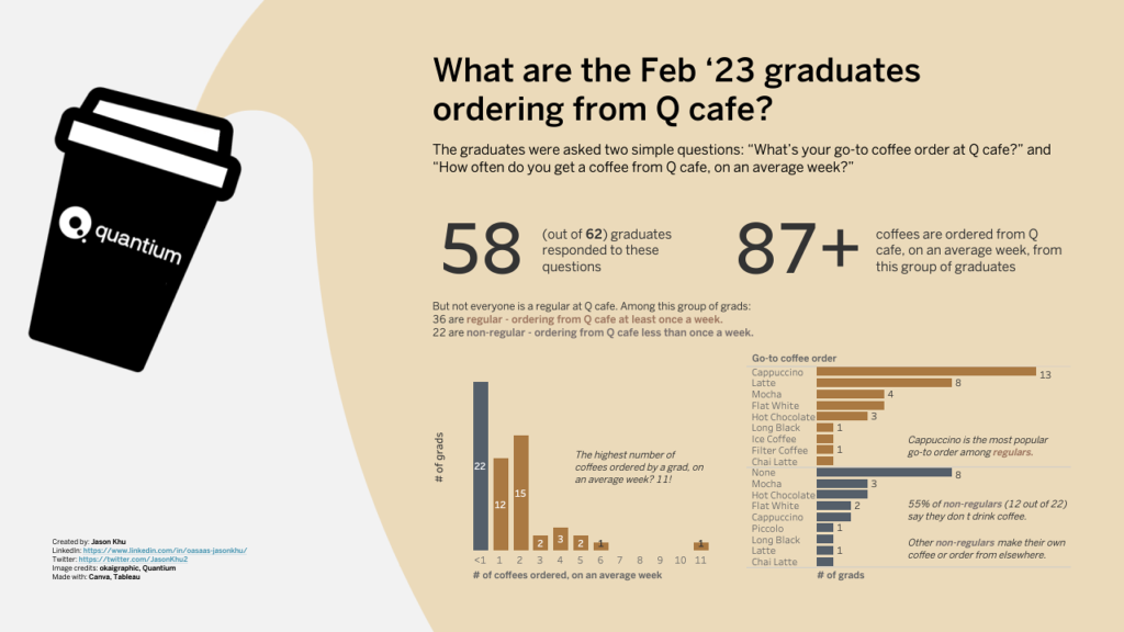
So I decided to create a project that would kind of connect all of us, by answering a simple question: ‘What are the coffee ordering/drinking habits of the 2023 Quantium graduates?’
Data (collection and cleaning)
There was only one way to collect this sort of data, and this was through a survey.
However, I didn’t want to make this appear as something official, or make it an obligation, so I didn’t email out a Microsoft form for everyone to fill out.
And so my data collection process was simple: I sent out text messages to all of the graduates in my cohort… each and every person in the cohort (that’s 60+ times).
I was conscious that people were busy and weren’t bothered going into detail. And I knew that if I wasn’t specific with my questioning, there would be a lot of nuance of figure out when analysing the data down the line.
So I didn’t go into asking how many sugars they use or what milk they use. And I basically just asked what coffee style was their go-to (at the Quantium café), and how many times do they get their coffee on an average week.
Using the responses, I created a dataset with the following schema, and I ensured that the entries were written correctly:
Name | Go-to coffee order | Number bought on an average week
Analysis
I didn’t spend too much time analysing, as I didn’t want the story to go in depth, or go in any particular direction (really).
My intention was to just create a data visualisation that plainly goes ‘here are the number of coffees that get bought, and here are the preferred styles’.
To answer the question, I already had two charts in mind – one to show which styles were the most popular, and one to show the distribution of coffees bought on an average week. And so those were the charts I considered in my mock-up (and eventually built out).
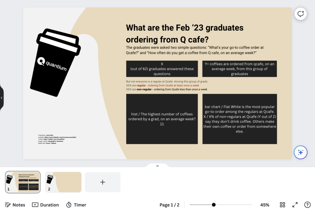
Wireframe/mock-up
Prior to building, I drew a quick sketch and then translated that over into Canva.
One of the things I really wanted to incorporate in my visualisation was the image of a Quantium-branded coffee cup. So I created one in Canva (with a clever coffee-spill effect) and exported it to use as a background image when building.
In terms of how I laid out the information/insights, I just used the classic dataviz structure when it comes to text: start with the context (and high-level numbers) and then follow it up with more detailed analytical observations/insights.

Build
Finally, referencing what I built in Canva, I created the data visualisation using Tableau.
I set the dimensions so that the coffee-cup image would fit nicely in the background, and I made all the text/chart elements floating with precise locations.
See the final product below, or interact with the visualisation on Tableau Public here: https://public.tableau.com/app/profile/jason.khu8035/viz/WhataretheFeb23QuantiumgraduatesorderingfromQcafe/Visual-TP

About the author
Jason Khu is the creator of Data & Development Deep Dives and currently a Data Analyst at Quantium.