How I built the graduate salaries dashboard
Posted on: February 2, 2024
Post Category: Data
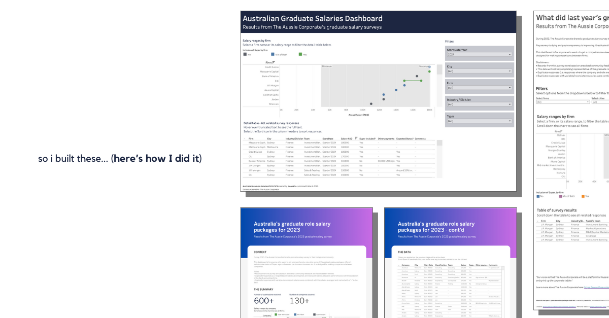
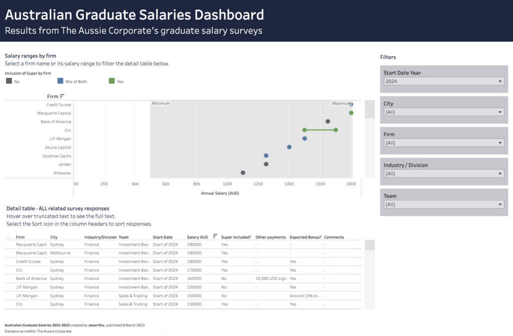
Earlier this year I shared a dashboard that enabled students/job-seekers to compare Australian graduate salary packages, offered from 2022 through to 2024. It is the third iteration of a dashboard/report I started working on at the start of last year, and I’ve designed this to be a dashboard that gets updated with the most up-to-date salary date (on a regular/yearly basis).
And in this blog post, I’ll be sharing the entire process of how I built it – from what inspired the question to publishing the visualisation on Tableau Public (hopefully in 5 minutes or less).
So I’ll talk about the following steps: Idea, Data, Analysis, Wireframe/mock-up, Build.
Idea
Talking about graduate programs, and talking about our graduate job offers, was a pretty big thing among my friends during my final year of University.
For context, I was a student at the UNSW business school, and getting a graduate job offer was generally at the forefront of every students’ minds when they are in their final year.
So I plainly thought it would be cool to create a dashboard/report breaking some of the graduate salary packages that have been offered previously (because
This type of data was made available courtesy of The Aussie Corporate and I thought it was a good opportunity to explore what I could build.
Data (collection and cleaning)
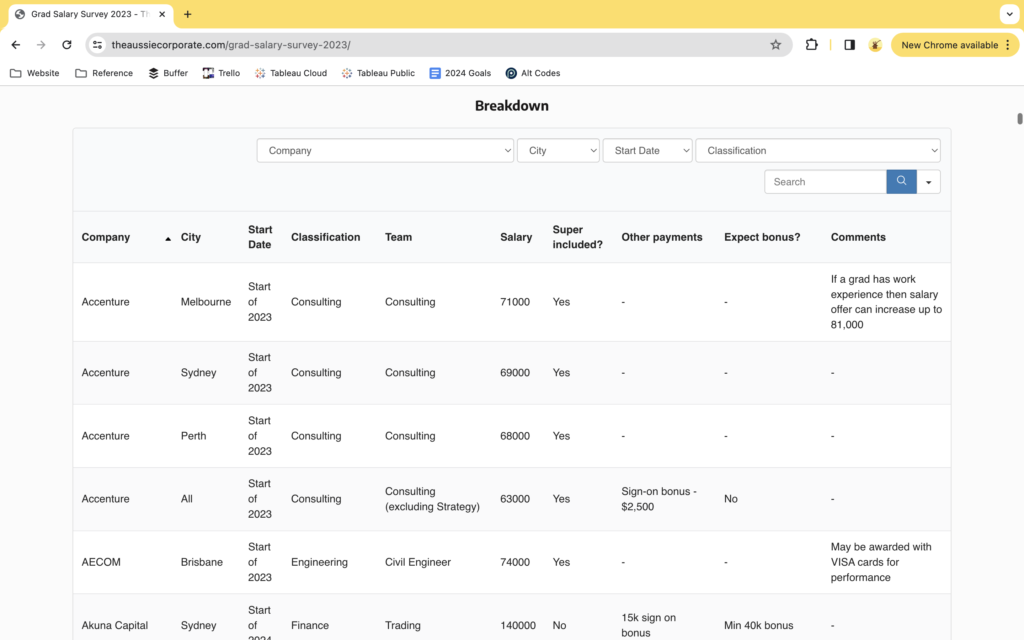
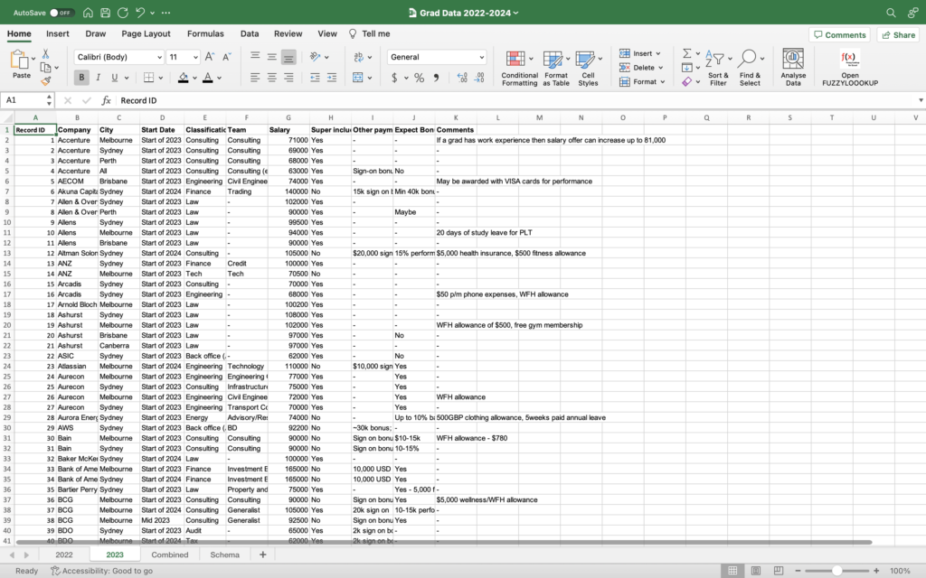
The Aussie Corporate shares the results from their graduate salary survey on their website in a tabular format, so the data collection was just a simple exercise of copying and pasting the data into Excel. The webpage and its contents are shown below.
And since it is survey data, there will be some little inconsistencies, but none of them couldn’t be handle by a couple seconds of work, using simple formulas and manual edits, in Excel.
Analysis
Regarding the analysis, I basically skipped this step.
I didn’t want the data visualisation to have a story per se. My intention was to create a dashboard-style visualisation for users to explore and get an overview of the graduate offers out there.
There were no insights I was looking for, just observations to report on if any.
Wireframe and mock-up
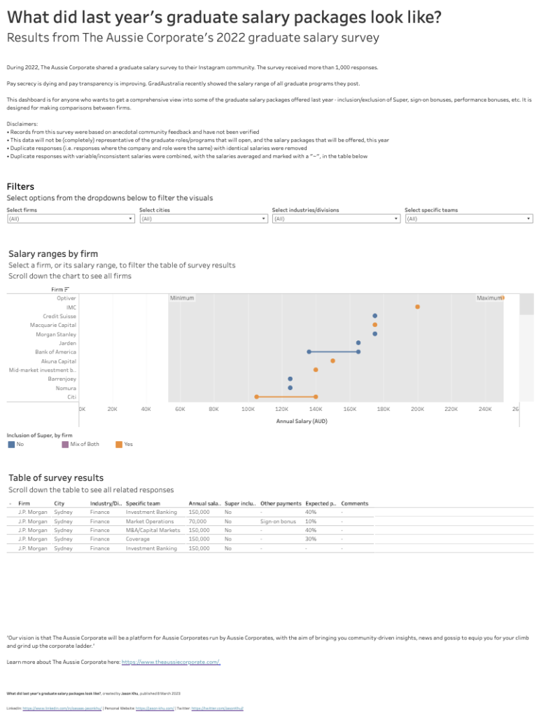
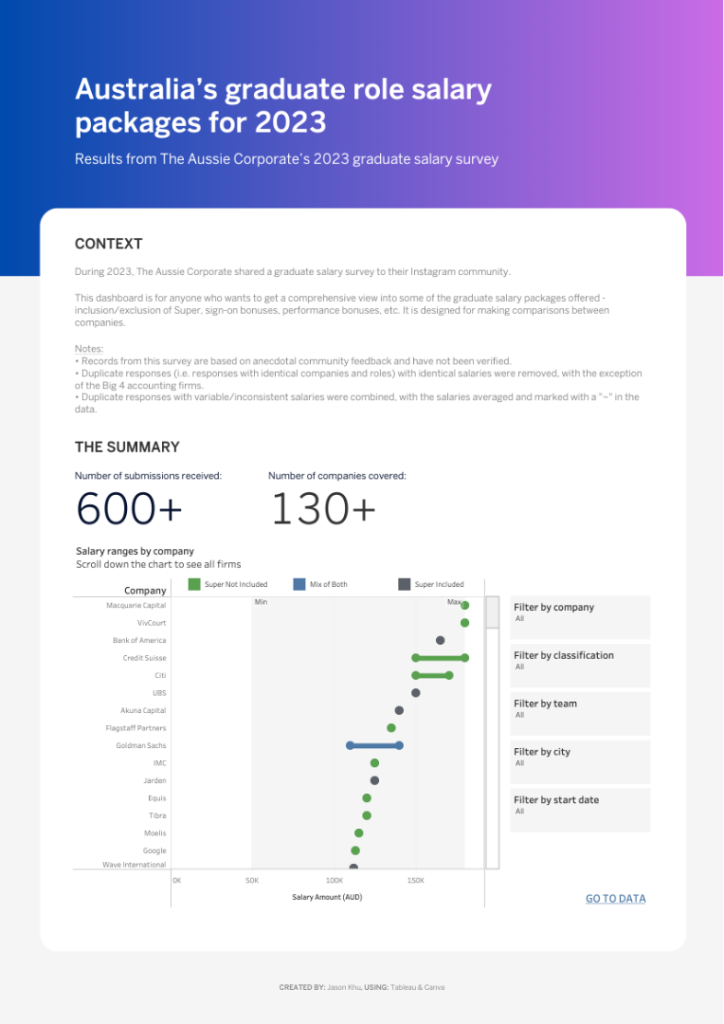
Using a dumbbell chart for this type of report/dashboard was at the front of my mind. Whenever my friends and I compared graduate roles/offers, we were ultimately comparing companies. So I thought it was valuable to produce a dumbbell chart showing the salary ranges for each company.
And since I was potentially sharing this dashboard with less data-savvy users, I decided to make it as accessible as possible. I wrote instructions whenever I could (in the chart subtitles), I provided context, I made the filters noticeable and intuitively placed, I resorted to very simple designs, etc.
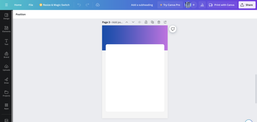
For my second iteration of the report in particular (which can be found here), I took a lot of inspiration from Jason Yang at the time – he’s another member of the Tableau community and back then he shared very compelling showcases of his IronViz submission. I recall he created an AirBnb report, which one of his earlier works on Tableau Public, and I used as the main source of inspiration when it came to the design. From there, I used Canva to create the design and background images, which then helped with my build in Tableau.
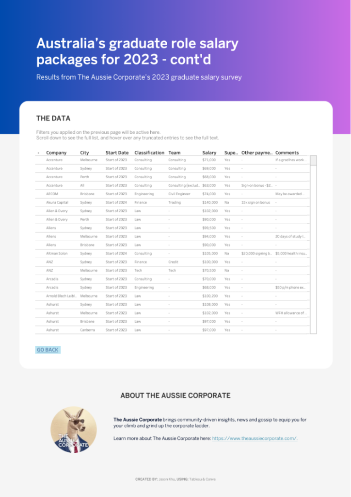
But aside from all of these considerations, I still valued the original dataset as it stood; to be fair, the dataset *did* give me inspiration to create a dashboard in the first place. So I decided to use the full dataset (after the cleaning stage) as a detail table, such that users could select companies/ranges in the dumbbell chart and have their selections be reflected in the table.
Build
Simply put: built it in Tableau, and used YouTube videos to create the dumbbell chart.

About the author
Jason Khu is the creator of Data & Development Deep Dives and currently a Data Analyst at Quantium.