A Quick Guide to Exploratory Data Analysis (EDA) and Descriptive Analysis
Posted on: June 2, 2022
Post Category: Data
Exploratory data analysis (EDA) is the initial method that is used by data analysts to quickly gain insights into their data – to test assumptions, observe errors and outliers, see relationships between variables and see opportunities to further clean or prepare the data. This is often done to enhance interpretation and support the preparation of the data for more complicated methods of analysis such as statistical machine learning.
Descriptive analysis is a method of analysis used to quantitatively summarise a dataset, often through charts and summary statistics. EDA depends on descriptive analysis.
This blog post will go over three common types of analysis involved in EDA: (1) detecting and cleaning up null/missing values, outliers and unexpected values, (2) univariate descriptive analysis, and (3) bivariate descriptive analysis.
1. Detecting and cleaning up null/missing values, outliers and unexpected values
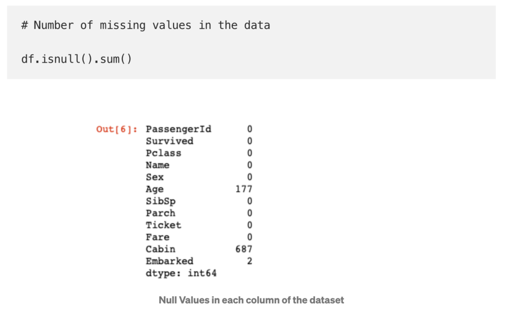
Data cleaning is one application of EDA, and data cleaning is crucial for preparing for further data analysis. There are three major types of quality/accuracy issues in data: (1) nulls or missing values, (2) outliers and (3) unexpected values.
- Nulls or missing values occur when there is no value specified. The method that should be used to fix these values ultimately depends on the data and relevant domain knowledge. These methods include imputing summary statistics such as the mean or median, deleting/dropping the entire row, or some method of interpolation such as linear or exponential interpolation. You can read more about nulls and the different ways to correct them in this Analytics Vidhya article and this Medium article.
- An outlier is any value that is unusual (usually unusually large or small) compared to other values in the column. ‘Depending on the data, sometimes outliers are expected values and other times they may indicate an error and may need to be edited, filtered, or excluded’ (Tableau 2022).
- An unexpected value is any value that is inaccurate or inconsistent with other values in the column e.g. a code for an aeroplane that does not meet the standards (or data constraints) of an aeroplane code at a particular airline company. Unexpected values may require cleaning.
2. Univariate descriptive analysis
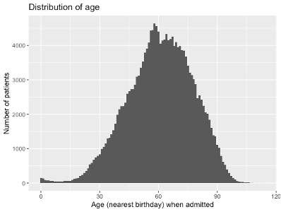
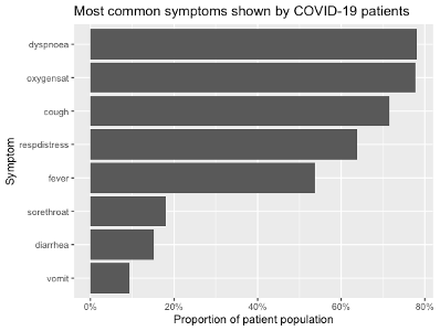
Univariate descriptive analysis involves quantitatively and graphically summarising one variable.
- For continuous numerical data, this often involves graphing the distribution using a histogram, density plot or boxplot, and computing the mean, median, mode, variance, maximum value, minimum value, etc.
- For categorical/ordinal and discrete numerical data, this often involves graphing the frequency/proportion of each category in the dataset – using a bar chart or equivalent – or computing frequencies and percentages in a distribution table.
3. Bivariate descriptive analysis
Bivariate descriptive analysis involves quantitatively and graphically summarising the relationship between two variables.
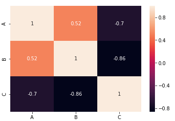
- A popular method of bivariate descriptive analysis is creating a correlation matrix, which provides a high-level overview of the correlation between all the different variables presented in a dataset.
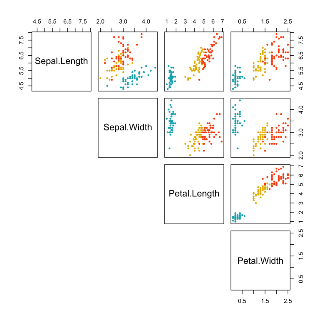
- Another method, suitable for small datasets, is to use a pair plot, where all variables are plotted against each other in a matrix. It can be thought of the graphical variation of the correlation matrix. Alternatively, standard plots can also be used to explore and perform deeper analysis on the relationship between any set of two variables of interest e.g. a nested bar chart may be plotted when examining the relationship between two categorical variables.
References
[1] Burns, E. 2021, Medium, accessed 30 May 2022, <https://towardsdatascience.com/data-cleaning-in-r-made-simple-1b77303b0b17>
[2] Data to Fish, 2020, Data to Fish, accessed 30 May 2022, <https://datatofish.com/correlation-matrix-pandas/>
[3] Formplus Blog, 2021, Formplus, accessed 30 May 2022, <https://www.formpl.us/blog/numerical-data#:~:text=Descriptive%20statistical%20methods%20used%20in,variance%2C%20standard%20deviation%2C%20etc.&text=Inferential%20is%20used%20to%20make,used%20for%20analyzing%20numerical%20data>
[4] Kabacoff, R. I. 2017, Quick-R by Datacamp, accessed 30 May 2022, <https://www.statmethods.net/graphs/density.html>
[5] Koehrsen, W. 2018, Medium, accessed 30 May 2022, <https://towardsdatascience.com/visualizing-data-with-pair-plots-in-python-f228cf529166>
[6] Mallidi, A. R. 2019, Medium, accessed 30 May 2022, <https://medium.com/bycodegarage/a-comprehensive-guide-on-handling-missing-values-b1257a4866d1#:~:text=The%20mean%20of%20the%20numerical,value%20or%20more%20frequent%20value>
[7] Seaborn, 2021, Seaborn, accessed 30 May 2022, <https://seaborn.pydata.org/generated/seaborn.countplot.html#seaborn.countplot>
[8] Seaborn, 2021, Seaborn, accessed 30 May 2022, <https://seaborn.pydata.org/tutorial/distributions.html>
[9] STHDA, 2020, STHDA, accessed 30 May 2022, <http://www.sthda.com/english/wiki/correlation-matrix-a-quick-start-guide-to-analyze-format-and-visualize-a-correlation-matrix-using-r-software>
[10] STHDA, 2020, STHDA, accessed 30 May 2022, <http://www.sthda.com/english/wiki/ggplot2-barplots-quick-start-guide-r-software-and-data-visualization>
[11] STHDA, 2020, STHDA, accessed 30 May 2022, <http://www.sthda.com/english/wiki/scatter-plot-matrices-r-base-graphs>
[12] Tamboli, N. 2021, Analytics Vidhya, accessed 30 May 2022, <https://www.analyticsvidhya.com/blog/2021/10/handling-missing-value/>
[13] Vanawat, H. 2021, Analytics Vidhya, accessed 30 May 2022, <https://www.analyticsvidhya.com/blog/2021/08/how-to-perform-exploratory-data-analysis-a-guide-for-beginners/>

About the author
Jason Khu is the creator of Data & Development Deep Dives and currently a Data Analyst at Quantium.